Authors, Writers, Publishers, and Book Readers
Share the story of your book cover please!
I've seen some cracking good book covers being showcased by our new members and I'm nosy. :D So spill the beans and tell us all about it please! Who designed it, where the idea came from, etc., as much detail as you like. It would be interesting to know how what we see today came to life.
If you could add the picture of your cover too to your reply that would be helpful. :)
Replies to This Discussion
-
Permalink Reply by Sean Noonan on
-
Here it is!
After much debate, trials and tribulations. We have created a cover that works not only as the cover of the book but also as a thumbnail for websites.
Just watch out for those Grimlees!!!
The first adventure will be released soon on kindle...
-
Permalink Reply by Patricia Gligor on
-
Mixed Messages, the first novel in my Malone mystery series, takes place the week of Halloween in 2008. Of course, my publisher and I wanted a cover that would best represent the book. We spent an entire weekend perusing several book cover sites and finally found this one. Because several scenes in Mixed Messages take place in a cemetery, we both felt that this cover was perfect for the book.
-
Permalink Reply by Carlyle Labuschagne on
-
I love cover talk!! There are many that blow my mind.
Mine came to me in stages and was put together by my publishing team. The image of the forest was one of the first images I used for my website, my twitter avatar and on facebook as this was e exactly what I envisioned my forest in my books to look like. The girl was not easy to come by, one she had to be blond - that in itself was very hard to come by. Two she had to be beautiful, to suck you in, haunting, venerable and strong in one glance. Many hours later and I think we did a great job.
-
Permalink Reply by Chris Stevenson on
-
I was actually taken aback, or aghast when my cover first appeared. I thought it was too stark, too large, in charge and in your face. I actually hated it. That was until I did a survey at my largest writing group. 95% of the posters gave it the thumbs up, most them enthusiastically. I wanted to know why. They said that it was great for thumbnail images, and that in its simplicity, it said all there was to be said about the subject matter. The wolf connection. I finally relaxed after understanding what they meant. When this wolf looks back at you, you get the picture--you're in trouble.
Here is the image at Amazon:
http://www.amazon.com/The-Wolfen-Strain-ebook/dp/B008G0PE2U/ref=sr_...
-
Permalink Reply by Karen Dale Stefaniak on
-
Just received my book in the mail, and this cover and this book is fabulous! And Mariah's dedication is wonderful. No, incredibly wonderful! Looking forward to this reading this, in probably one sitting!
Mariah de la Croix said:
Here's the final cover for my book, due out in September, 2012. The cover was designed by Ellen Lawson of Llewellyn Publications; a division of Llewellyn Worldwide Ltd. They asked for my input as to different ideas and layouts for the design, but in the end I finally let them run with their ideas as mine were too busy.
-
Permalink Reply by Jennifer FitzGerald on
-
How much did it cost to hire a model?
Rosemary Gard said:My book Destiny's Dowry contains many original facts. It is fiction and a mystery, but the Dowry theme plays throughout the story.
The model on the cover is wearing a handmade ethnic costume of Croatia, which was part of my own Dowry.
The heroine of the story is red haired as is the model. The story takes place in Croatia in the early 1900s, so we went with an outdoor country look. I am pleased with the cover because it shows the strength of a Croatian peasant woman wearing a dress that was made from linen grown, spun, woven, sewn and embroidered by her and her family.
-
-
I actually give a complete walk through of how I created my cover within my book. It was actually on of the most difficult covers for me at the beginning to figure out just what to put on it so people would understand that it is about making book covers at a glance.
-
-
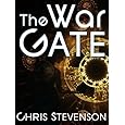
My paranormal romance/thriller The War Gate, was originally published by a small press. It was then titled Gate Walker. The cover consisted of a half-naked man with a woman to his side that appeared as a wispy outline. The plot of the book featured a heavy time-travel aspect, and I felt it was not represented with this small press cover. When I self-published this title, after having my rights returned, I let a friend do a mock-up. She positioned a character who is leaning toward what appears to be a time portal, a system of geographic images, almost like a geared gateway. This, I thought, represented the storyline much better. The first rendition seemed to suggest an erotic ghost story, which it was not. I'll see if I can upload both images for contrast, or I'll leave a link to the present cover.
THE NEW COVER
THE OLD COVER

-
Permalink Reply by Matthew Davenport on
-
My covers have gone through a migration. My first book: Random Stranger, is about an idea made flesh, an Abstract, that is just a "random stranger" that people run into, so I knew that I wanted an outline of a shadowed man. Originally, I'd hired my best friend and an artist to do the work for me in pastels. He came up with the idea of a shadow standing in front of a piece of abstract art (as the main characters are abstract ideas). At the time, it sounded genius, but after implementation, both of us were disappointed.
That was when I decided to play around with GIMP (the open source version of photoshop). After some time, I decided that I still wanted the shadow, but the first book took place (on and off) in a diner, and I wanted that to be the scene for it. I then decided that the entire project looked like it was missing something, and played around with a couple of the features in GIMP before I found that you could set up a point of light, which I thought worked well in conjunction with the magic in the book as well as the shadowed man, and thus the final cover for Random Stranger was born.
After that decision had been made, and I'd finished writing book two in that same series, it was an easy jump to follow the same formula with Stranger Books, the sequel. In Stranger Books I wanted the same light aspect as well as the scene depiction. This time though, I wanted to tip my hat to my friend who made the original cover, and set it on the table in picture. As if it was just another book in the library. Anyway, GIMP/Photoshop and learning it definitely paid off.
-
-
I agree with you on your first cover. Looks like erotica. Although the second cover isn't really poping the story out to me either. I didn't see the person in the thumbnail and the time portal just looks like a gadget. Might wan to keep working on it a little more. Time portal needs to portray time somehow.
Just my thoughts.
Jenn
Chris Stevenson said:My paranormal romance/thriller The War Gate, was originally published by a small press. It was then titled Gate Walker. The cover consisted of a half-naked man with a woman to his side that appeared as a wispy outline. The plot of the book featured a heavy time-travel aspect, and I felt it was not represented with this small press cover. When I self-published this title, after having my rights returned, I let a friend do a mock-up. She positioned a character who is leaning toward what appears to be a time portal, a system of geographic images, almost like a geared gateway. This, I thought, represented the storyline much better. The first rendition seemed to suggest an erotic ghost story, which it was not. I'll see if I can upload both images for contrast, or I'll leave a link to the present cover.
THE NEW COVER
THE OLD COVER
-
Permalink Reply by John Brantingham on
-
I did not like my book cover at all. I felt it didn't reflect what was on the inside, but I also understand that the cover art is the work of a professional, so I let it go. The publisher liked it and thought it would get people to read the words inside, so I was happy to go with that.

-
Permalink Reply by Kay Elizabeth on
-
That's interesting that the publisher still wanted to go with it even if you yourself didn't feel it reflected the content, John. As a reader I would feel duped to be honest. You'd think they would have considered that possible viewpoint. While it wouldn't affect that particular sale which was already done and dusted, I think it would make me seriously consider future purchases. That would be a real shame for you. Of course not all readers may feel the same.
And btw, cover art by a professional is no guarantee they even read it first beyond a synopsis. Personally I think that should be non-negotiable although I do understand they have time constraints like anyone else. I just don't see how they can do a book justice without having done so.
John Brantingham said:I did not like my book cover at all. I felt it didn't reflect what was on the inside, but I also understand that the cover art is the work of a professional, so I let it go. The publisher liked it and thought it would get people to read the words inside, so I was happy to go with that.
Sponsored Links
Most Active Members
Publishers Weekly
NPR Books
NY Times Book Reviews
© 2025 Created by Authors.com.
Powered by
![]()